pieper
September 26, 2021, 5:52pm
1
Hi OHIFers -
I wonder if anyone here has a comment on the 3D Slicer thread linked below. TL;DR we are talking about switching icons to something simpler and easier to customize and extent. The question came up about sharing icons and maybe even color schemes or other design UI/UX conventions with OHIF so I thought I’d check here.
Slicer:master ← lassoan:improve-icons
opened 11:50PM - 22 Sep 21 UTC
This is a work in progress and the pull request is submitted so that we can star… t discussion before proceeding with further updates.
A few new icons are added that use more modern style (flat, duotone) and have higher resolution, and look OK over both light and dark backgrounds. All icons are based on Google material design icon set (https://fonts.google.com/icons), edited in Inkscape, exported in native 24x24 and double 48x48 resolution.
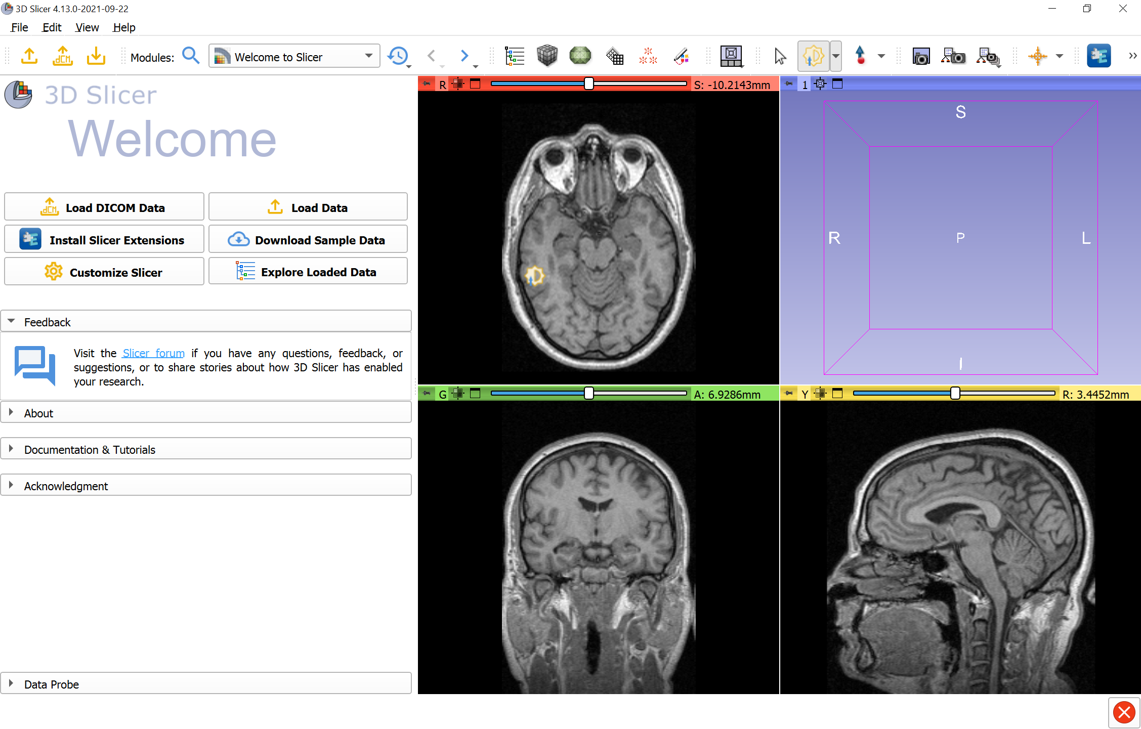
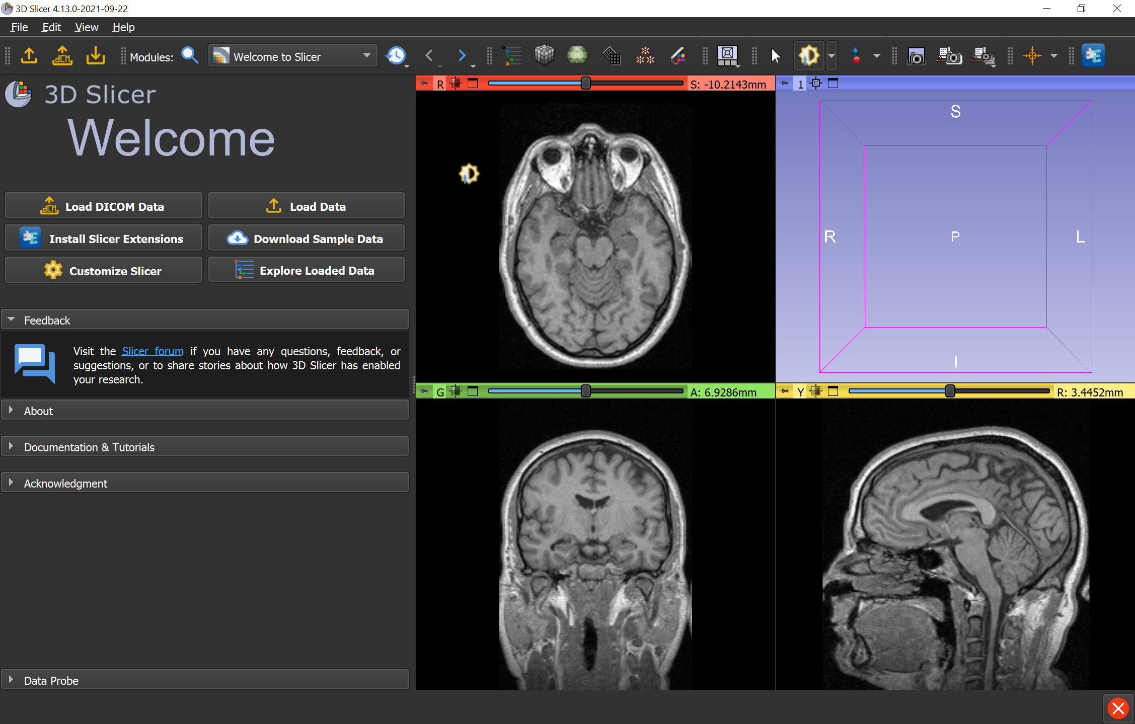
A summary of the overall effort is described on this labs page: https://github.com/Slicer/Slicer/wiki/Modern-Look
Questions:
- Does the workflow of getting SVG from "Google material design" icon set, editing in Inkscape, exporting to 24x24 and 48x48 sound good? *Update:* with carefully designed (SVG with coordinate units set to pixels, all lines aligned to pixel centers, etc.) it is possible to use a single SVG icon in the resource and Qt can scale it. This would simplify icon updates (we would only need to store one file). This is already done for a few icons. We may not want to use this for all icons (e.g., for those that contain text, because I don't know what fonts Qt can render), and we may not have all icons in SVG, so for some icons we may still need to use multiple bitmaps.
- Is this minimalistic style, web-like generally a good direction? It would mean that we would need to replace all the icons that come from the Qt theme (as they are more detailed, 3D-like style). There would still be some inconsistency, as buttons themselves have a kind of 3D/gradient look (but maybe that could be removed by adjusting the color table).
- Should we use the same colors in light and dark mode? Switching over to different icons or somehow dynamically recolor all the icons could result in better contrast, but could be much harder to implement. Or should we add shadows (that would improve contrast but would make it a bit more difficult to create the icons). Or should we just go all-in on dark mode and remove light mode completely?
- What colors should we use? We could use the same 2-3 colors for all icons, or we could use different colors for different categories (e.g., file operations are orange, markups are blue, segmentations is green, ...) but we might run out of nice, distinguishable colors that work well over both light and dark background; and it may be difficult to be consistent. However, more colors can make it easier to find buttons. For example, above the blue module selection buttons separate nicely from the yellow file load/save icons.
-Steve
3 Likes